A clean UI doesn’t try to impress with too many effects. It simply helps users feel comfortable, understand the layout instantly, and move around without thinking too much. Good design should feel invisible. When someone enjoys using your app or website without stopping to figure things out, that’s when your UI is doing its job.
A clean and engaging UI comes from a mix of clarity, spacing, color balance, and thoughtful interaction. Let’s break this down in a way that you can start applying right away.
1. Start With a Clear and Simple Layout
When users open your interface, they should understand the structure within seconds. A layout that guides the eye makes the whole design feel calm and easy to handle.
A clean layout doesn’t overload the screen. It groups related elements together and keeps enough free space around them.
Example:
A login page that only has a title, two input fields, and one primary button feels simple and direct. It tells the user exactly what to do, without any extra noise.
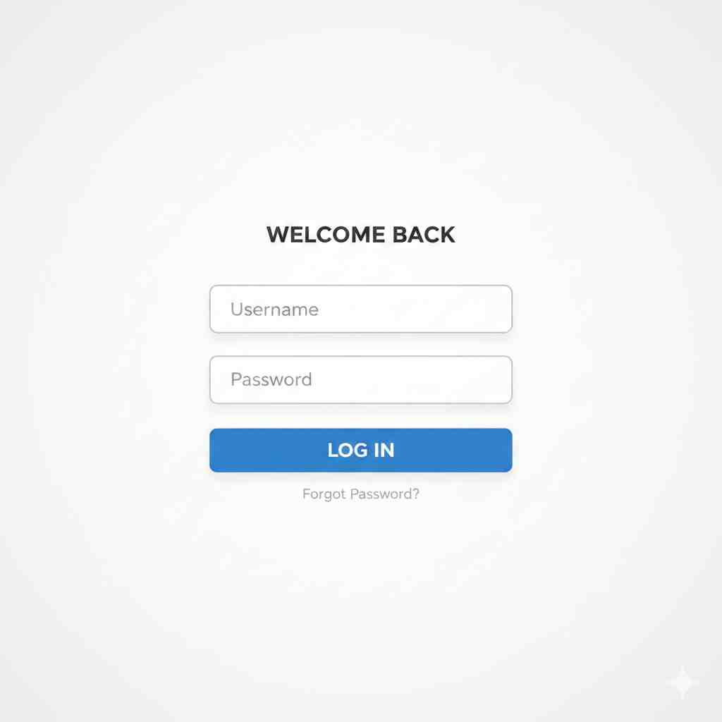
👉 Clean login screen exampl
2. Keep Color Choices Balanced
Colors set the mood. But too many colors at once can make your UI feel messy. A simpler palette helps users focus on the content rather than the decoration.
Choose a main color for actions, one for text, and a neutral color for backgrounds. This creates order and builds brand consistency.
Example:
A food delivery app that uses one bright accent color for main buttons, while keeping backgrounds soft and neutral, feels much more polished.
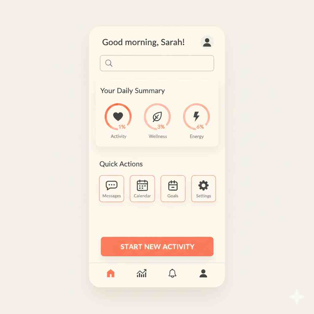
👉 App screen with balanced colors
3. Typography Matters More Than You Think
A clean UI is impossible without readable text. The easy rule is: big headings, medium subheadings, and comfortable body text. Avoid mixing too many fonts. One or two well-chosen fonts work best.
Spacing between lines, contrast between text and background, and the weight of the font all play a big role in how smooth the UI feels.
Example:
A product page using one font family but different weights makes the information clear without feeling heavy.
4. Use Spacing Wisely
White space is your best friend in UI design. It creates breathing room and makes everything look organized. Crowded designs feel cheap and confusing.
Spacing helps users scan faster, reduces cognitive load, and improves the overall experience.
Example:
Think of a product card where each element—image, title, price, and button—is placed with enough space. It looks cleaner, more premium, and easier to read.

👉 Product card with generous spacing
5. Build a Strong Visual Hierarchy
Hierarchy guides attention. Your most important elements should always stand out the most. Use size, color, and spacing to tell users where to look.
A primary button should never look the same as a secondary action. This clear difference avoids confusion and speeds up decision-making.
Example:
A checkout page where the “Continue” or “Pay Now” button is bold and bright naturally draws the eye first.
Also Read: Why Your Website’s “Assembly Line” Needs a Modern Upgrade
6. Use Icons That Help, Not Distract
Icons should communicate instantly. Simple, familiar icons improve clarity, but decorative or vague icons slow users down.
Stick to universally understood symbols. Consistency in icon style also makes the UI feel more unified.
Example:
A search bar with a basic magnifying glass icon is instantly recognizable anywhere.
7. Keep Interactions Smooth and Predictable
A clean UI is not only about how it looks, but also how it feels. Buttons should respond with small animations, transitions should be smooth, and navigation should behave exactly as expected.
Clear feedback helps users feel in control.
Example:
A button that slightly brightens when tapped gives users a small but useful confirmation.
Final Thoughts
Clean UI design is all about intentional choices. When you remove clutter, balance colors, improve spacing, and guide the user thoughtfully, everything feels smoother. A clean interface builds trust and keeps users coming back because they know the experience will be easy and pleasant.
If you want, I can add SEO details, a feature image, or turn this into a fully polished blog article for your website.